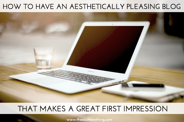
 Although we probably shouldn’t, most of us judge a book by its cover. If we don’t like the cover, we probably won’t want to know what’s inside and because of that, we may be missing out on something awesome. The same goes for blogs. Your blog design is one of the first things people see when they arrive to your space on the web. It makes a first impression on visitors and is one of the determining factors, along with content of course, for whether or not they are going to stay. If your don’t have an aesthetically pleasing blog, chances are readers might not even give your content a chance because they’re judging your blog by it’s cover, or design I should say. There are a few ways to change this and make sure your blog is as aesthetically pleasing as possible. By having an aesthetically pleasing blog, you’ll be sure to make a great first impression. Just follow these tips!
1. Get rid of the colorful background and text.
The last thing readers want to do is strain their eyes trying to read your hot pink font on a black background. There are many ways to add color to keep things fun and bright without placing it in your background or main text. You should keep your background white, or at the very least, a very subtle neutral tone that is easy on the eyes. White is also much more professional looking. You can never have too much white space, and gives the eyes a break, which is a good thing!
2. Make your photos the same width of your post text area.
This means get rid of the tiny photos that aren’t even half the width of your text. Taking the time to resize your photos to match your post width will make all the difference. Also, bigger photos are always better than small! As beginning bloggers, most of us are guilty of this mistake (myself included) as we learn the ins and outs of how the post editor works.
3. Include at least one photo in each post.
There are no official rules to blogging, and you can most certainly write a novel without a photo if you choose, but it’s been proven that readers like something to look at. A high quality pretty or relevant image will draw readers in (avoid grainy cellphone or dark lighting pics). If you’re writing a long post, multiple photos between large amounts of text will give your readers a break from reading while keeping them interested.
4. Use an easy to read font.
A good rule of thumb to follow is this: if you wouldn’t use that font for your resume (if you have to question it, you probably shouldn’t) then the same goes for your blog. You want a font that is easy to read and clean looking. It’s fine to use a fun font as an accent element on your blog, but for your main post area, keep it simple.
5. Justify your text.
There are mixed opinions on this, but I personally believe this is the best way to achieve a clean look within your post area. When your text is justified and your photos are the same width of the text (full post width), it creates fine lines within your post for a sleek look that eliminates any choppiness of text exceeding your image or lines within a paragraph being longer or shorter than others.
6. Keep it simple.
Ask yourself if you really need it. Eliminating extra junk from your sidebar helps you get the less is more look. For example, do you really need your own blog button on your sidebar? Perhaps placing it in your advertise section is better. For me, I did away with sidebar items I didn’t need on my main page and placed them elsewhere.
7. Invest in a designer.
One of the best things you can do is invest in a professional blog design if you don’t feel confident enough with your designing skills. You can find designs at all price ranges. A little goes a long way. Your design will probably be the biggest and best investment for your blog. Remember, you’ll be judged by your cover, so why not make a great first impression!
8. Be consistent.
Being consistent will tie your brand together. Try to follow the same format/theme for each post you publish and each blog page you create. Focusing on the small details will deliver a more professionally put together blog.
What advice would you give to achieve an aesthetically pleasing blog?




Musings of a Wanderer says
Great tips! I need to get better about making my photos the same width as my text but I'm just a fan of smaller photos
Kenji is Here says
So true, I agree with all of these. I've definitely felt like I needed to clean things up on my sidebar. Thanks for the advice!
Kari Guastella says
Love these tips! Thanks for sharing!
Kari
http://www.sweetteasweetie.com
Christine says
These are all great tips. Thanks for writing!
Julia says
Great tips! I totally agree with all of these! Especially the one about background and text color, I have tried reading a few blogs that have really extreme background or text colors but they are SO hard to read and it hurts my eyes so I end up giving up!
Simply Sam xo says
I am totally guilty of judging a blog by it's blog design. I used to love the colorful blog designs but lately I'm more attracted to the simple and elegant themes. Your new theme is gorgeous btw!!
Darianne says
guilty of blog design judging. I try so hard to pay attention to someones post, but when your design is all over the place it gives me anxiety LOL. xx
Alissa says
Thanks for the tips! I totally agree, I always justify my posts and sometimes it just irks me if I find a post that's not justified. haha
Dara @ The Southern Thing says
You're welcome! I'm the same way! Sometimes Blogger just won't cooperate and won't accept any formatting changes. It drives me nuts!
Alissa says
Thanks for the tips! I totally agree, I always justify my posts and sometimes it just irks me if I find a post that's not justified. haha
Ashley LaMar says
I agree with everything except for justified text. Most experts will agree that justified text creates excessive eye strain when used for long chunks of text, blog posts, magazine articles, brochures, books, etc. The human eye naturally reads from left to right and it naturally looks for an end of the text. This is achieved by punctuation and right margins. Having text NOT justified leads the eye to the end and allows for visual rest before processing the next bit of information. Justified text is meant to be used only when the reader is supposed to take in the entire block at once.
Dara @ The Southern Thing says
Interesting perspective! If that observation has been backed by research, then I can believe it may be easier on the eye for some. For me personally, reading justified text doesn't strain my eyes, so I prefer to view the cleaner look it offers.
Kati Rose says
Number one – YES. My vision goes all funky trying to read on a black background to the point I won't even try now. You can have flair and personality but keep it clean with a sleek white background.
Nancy po says
Good tips, but personally I find white backgrounds boring. I do find photos overlaid over weird backgrounds really too hard to read to bother. WAY too busy. For me I'm reading blogs for fun, not for professional reasons. I do it and want it to be fun and creative, within norms. And since I blog for free I won't pay someone when I don't get paid 🙂 Nancy@LittlehomesteadinBoise