Today I would like to share with you my thoughts on the new update. I have very mixed feelings about it. Some parts of the update are pretty cool, but others are quite disappointing.
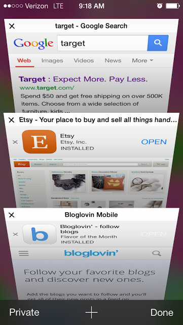
Safari: I am loving the new tab viewer for all the open web pages! I’m also a fan of the bookmark icons that appear below the search engine box.
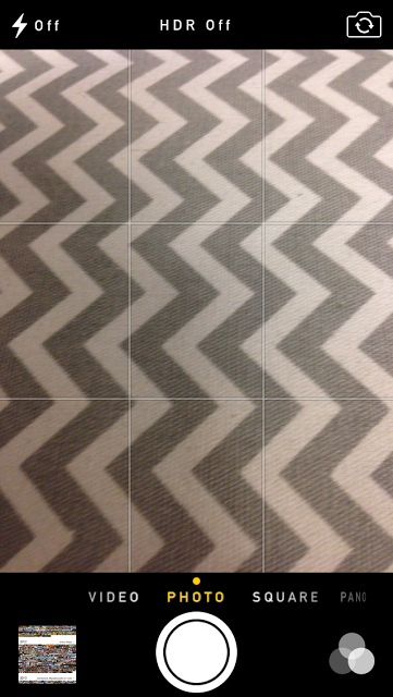
New camera: The square option is genius. I would imagine this working great for Instagram photos!
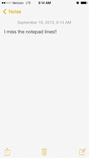
Notepad: Where did the lines go!? Once again, cluttered and unorganized looking. Come on, Apple!
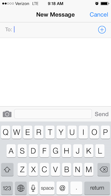
Keyboard: I am not digging this black and white scheme. My eyes feel like they’re going to burst. I give this one a negative 100.

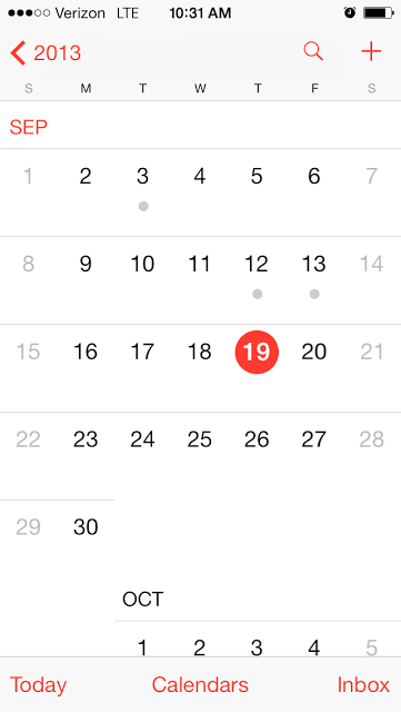
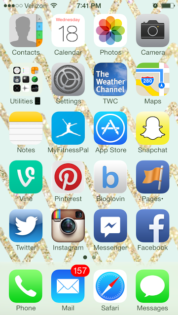


Nini Kat says
I haven't played with it enough but so far I like it. It looks different so in my mind I tell myself I got a new phone. I also like that everything is in the same place for the most part!
Meghan says
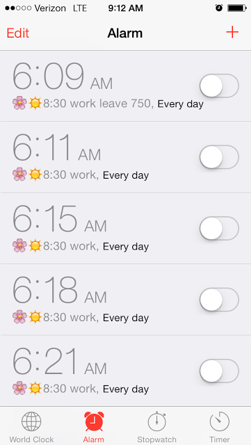
I'm still getting used to it. It's very much like a brand new phone! I like the way you have 5 alarms set to wake up in the morning 😉
Elizabeth at Southern Finesse says
I love the new drop down screens and the lock screen. The new look and functionality of the folders is great as well. I agree about the clutter. The new 'flat' design does make a lot of the features look more cluttered. I wish the colors were a little darker too because I feel like I'm staring at a neon bar sign all the time now. But overall, I like it!
Stephanie says
I agree about the alarms, it makes me anxious. I'm undecided, I'm still playing around!
Kelley says
Amen.
Tiffany Khyla says
My biggest problem is with the alarm. I feel like it's so much easier for me to accidentally turn off my alarm now rather than hitting snooze. I know this because I did it this morning and woke up late. 🙁 Sad. Overall, I really like the look though!
Brandi says
I just wish I could download the update. It keeps telling me I don't have enough room.
Analilia says
Try backing up your phone to itunes or icloud. Then delete photos. Update should work. Everything you deleted can be returned to your phone if you want
Noor says
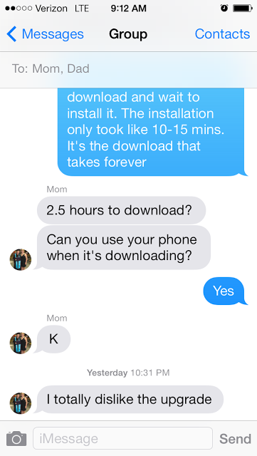
I am hating the new messages look , the old look was classic though .
PS : Alaram at 6:21? Mine starts at 20 and I wake up at 30 . Win-win.
Sara says
I'm still feeling it out, overall it's pretty neat.
Kate @ Another Clean Slate says
I just downloaded it this morning. I don't really like how it transitions from apps but haven't explored too much yet.
Helene in Between says
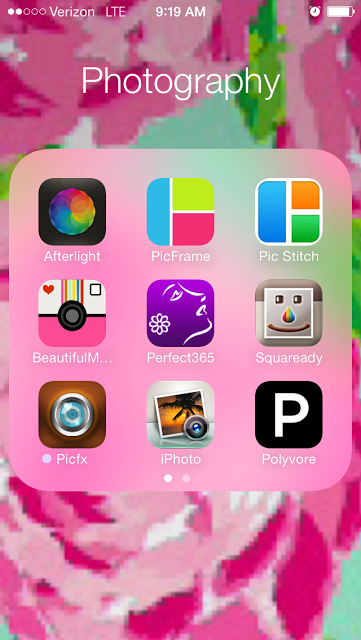
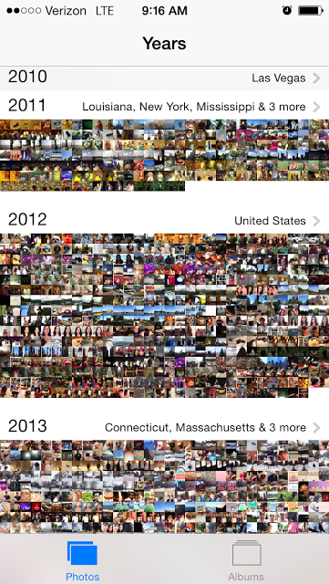
i haven't updated yet so this is interesting! I need to come back to this post after i'm fully done but the picture thing is cool!
Monic Sutter says
Hey Dara,
I downloaded mine last night. Overall I think I just love the new text and ringtones and the itunes radio =)
xo
M
simply sutter
Jasmine Maria says
I downloaded mine last night and I was in love with it. I definitely agree with the "notepad lines". I want them back. I also think that the text message is too cluttered.
Jessica says
I am too scared of change to update it :/ I think I will eventually need to suck it up though !
P.J. says
I'm in the middle with the update. I waited a day or so to make sure it wouldn't take me too long! I don't mind some of the things, such as the tabbed browsing and the camera updates. I didn't realize that about folders, but glad I read this because I'm not going to make it so I have fewer folders.
The texting screens are annoying to me, too. Too busy. It's also a little "too hip" looking for me. I don't mind it, but I liked the look of the last iOS a little better. Such is life, though, eh? Guess I'll have to get used to it!
stopping by from the weekend wander hop
emilyladau says
Came here via the Weekend Wander for the NE Bloggers Network and I'm glad I did! I've been debating upgrading to iOS 7 so it was helpful to see a breakdown of screenshots!
Kate at Green Fashionista says
I haven't been able to download the update yet because it tells me I don't have enough storage for it. So I deleted a ton of apps, pictures, texts, you name it and for some reason my storage didn't change AT ALL. So yeah… no update for me and I'm on the fence of whether or not to get the new phone since I'll lose unlimited data.
Found you on Sami's link up, love your blog 🙂
Bonjour! says
,,,ditto on your pros and cons. i especially miss the lines on the "note pad" i like my legal pad. old school. and the calendar, gosh i just don't care for it. too busy. i thought the old way was much better. c'mon apple! it it isn't broken, don't fix it!,,,
Tenns Reid says
I have some of the same thoughts as you, especially about things looking more cluttered. I feel like everything is supposed to come across as clean, but is essence is displeasing to the eye. I find that iOS7 lags in most of the navigation. Its not nearly as fast as the old operating system. I feel like iOS7 is a little convoluted and that it needs to be revamped to run faster. Seems like they are making the phone do too much and it can't keep up or "think" fast enough.
Tenns @ New Mama Diaries